From a single symbol, a whole fairytale world unfold
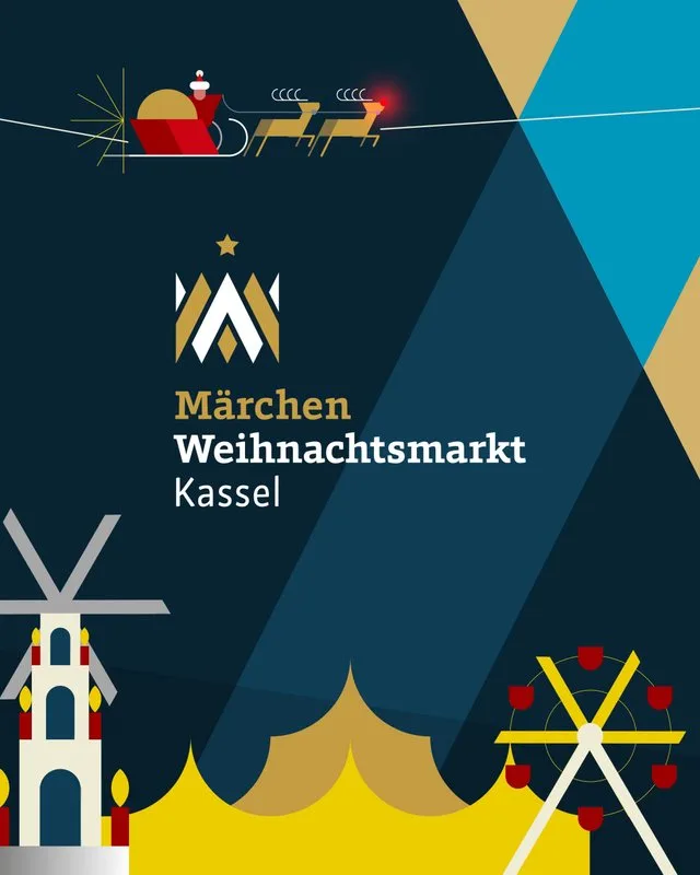
A crown, two letters, a grid – and from these, an entire visual world. For the Kassel Fairytale Christmas Market, we developed a brand identity that translates tradition and contemporary design into a cohesive visual system. The starting point is a reinterpreted crown, its points simultaneously forming the letters M and W. Its geometry also provides the grid for the entire brand identity, from which Christmas trees, stars, fairytale figures, and entire scenes were created. Shapes, motifs, and typography follow a shared design logic and can be recombined in new ways – consistently applied from posters and social media to the market plan. The focus is also on connection: encounters between people and shared experiences across generations.